Windows 10 Redesigned “About” Page: A UI Disaster Inspired by Windows 11
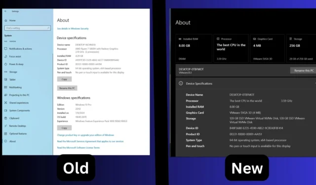
While Windows 10 was expected to be phased out, it continues to receive updates and features reminiscent of its successor, Windows 11. Recently, Microsoft introduced enhancements such as the Copilot tool, previously limited to Windows 11, alongside the new “Microsoft account”manager integration and an updated About page UI borrowed from Windows 11.
In a recent rollout for testers in the Release Preview Channel, Microsoft released an intriguing update that revamped the About section within the Settings app. This redesigned UI streamlines the presentation of available components and system information. However, a notable concern arises regarding its compatibility with the existing Windows 10 UI standards.
Windows Latest has highlighted the stark contrast between the original About page and the new design. The previous layout featured distinct sections detailing device and system specifications, while the revamped version consolidates critical hardware details at the top for better accessibility.
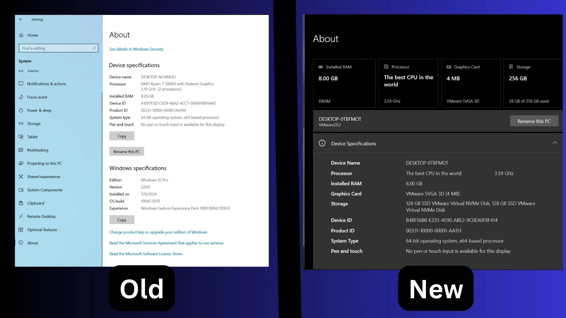
This new grid layout is visually appealing and allows users to quickly grasp essential hardware details, such as the GPU. Another improvement is the addition of collapsible sections. The previous About page displayed all information uniformly, lacking presentation finesse.
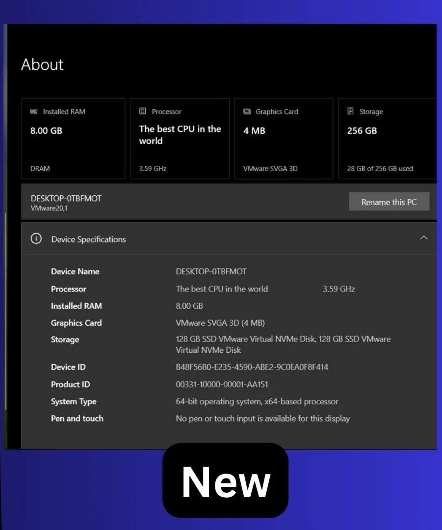
Taking cues from Windows 11, Microsoft has now integrated collapsible areas for Device Specifications and System Specifications, resulting in a clean and organized interface. The Rename this PC option has also been prominently placed at the top, similar to its placement in Windows 11.
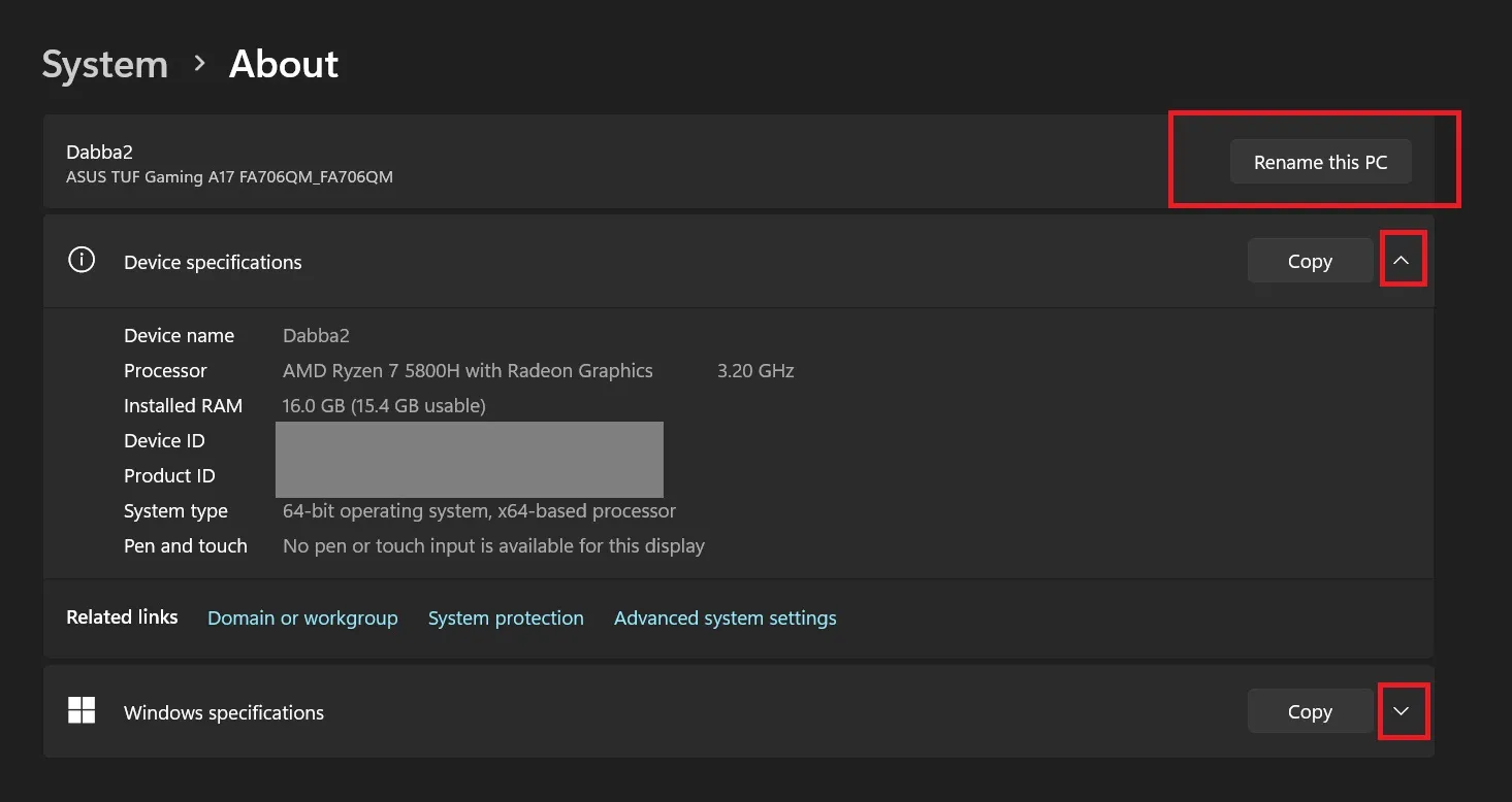
Within the Device Specifications section, users can find a few FAQs. Although they’re quite generic, these might provide helpful insights for those unfamiliar with system specifications.
A peculiar observation is the blending of Fluent UI and Metro UI, which results in a somewhat unappealing aesthetic. While we appreciate the layout, the color schemes and design elements fall short of the expectations set by modern operating systems.
Nonetheless, it’s surprising to witness such a design update for Windows 10, particularly as it approaches its impending retirement. Microsoft also intends to incorporate the Windows 11-style Account Manager into Windows 10’s Start menu.
Introduction of Account Manager in Start
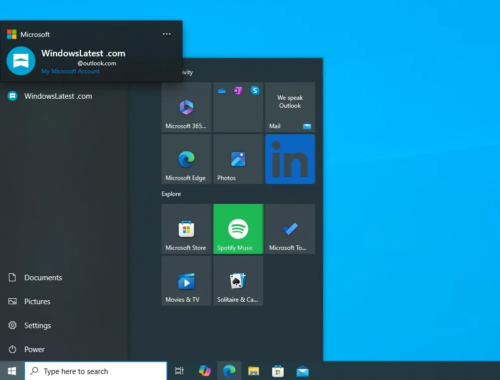
Expect the Account Manager feature to debut in the Start menu with the optional updates slated for October or November.
The release was delayed due to multiple design modifications. Notably, the Sign-out button has been repositioned to the top, and users can switch accounts via a more accessible context menu.
Additional adjustments to the Start menu were also implemented in the October 2024 security update, where the profile icon’s location was altered, and the left pane gained a fresh background color.


Leave a Reply