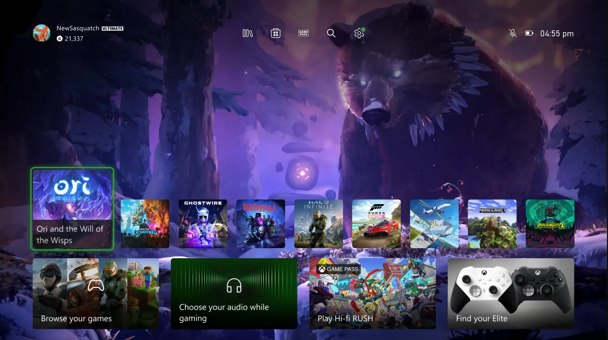
Microsoft announces a new and simplified Home experience for Xbox Insiders

Microsoft has announced a redesigned dashboard for Xbox Insiders in the Alpha Skip-Ahead and Alpha Ring. The latest version addresses feedback Microsoft gathered during its months-long experiments with the Home screen, such as space issues with a new dashboard variant and an overly crammed UI layout.
Here is what the revised variant will offer this week to those testing early Xbox updates:
- Simplified navigation with better access to the Microsoft Store, Xbox Game Pass, search, and settings. All those options are now available at the top of the Home screen.
- Decluttered dashboard layout with more emphasis and space for your backgrounds. Some tiles are now smaller, while others Microsoft moved to the bottom of the screen.
- A new responsive art feature will change your dashboard background to show off beautiful art associated with each game.
- The “My games & apps”tile now can let you know if an app or game needs your attention.
Microsoft has added that the announced changes do not represent the final experience, so Xbox Insiders can expect more tweaks and refinements before the public rollout. You can learn more about the latest dashboard changes in the Xbox Insider program in a blog post on the official website.
Leave a Reply