Microsoft Advocates for Windows 11 Store User Interface, Claims Results Are “Very Positive”
The Windows Store has become not only more feature-rich but also considerably faster with Rudy Huyn at the helm, a name familiar to those who followed the Windows Phone journey. While enhancements in performance and features are evident, the revamped Store UI has drawn criticism from both users and developers alike. Microsoft asserts that these adjustments are based on user feedback.
Albacore, a prominent figure in the Windows community, publicly challenged Microsoft on X, expressing dissatisfaction with the new Store UI’s aesthetics. He likened the updated layout to the previous Windows 10 design, arguing that it feels reminiscent of an era when pages seemed “unfinished at launch.”
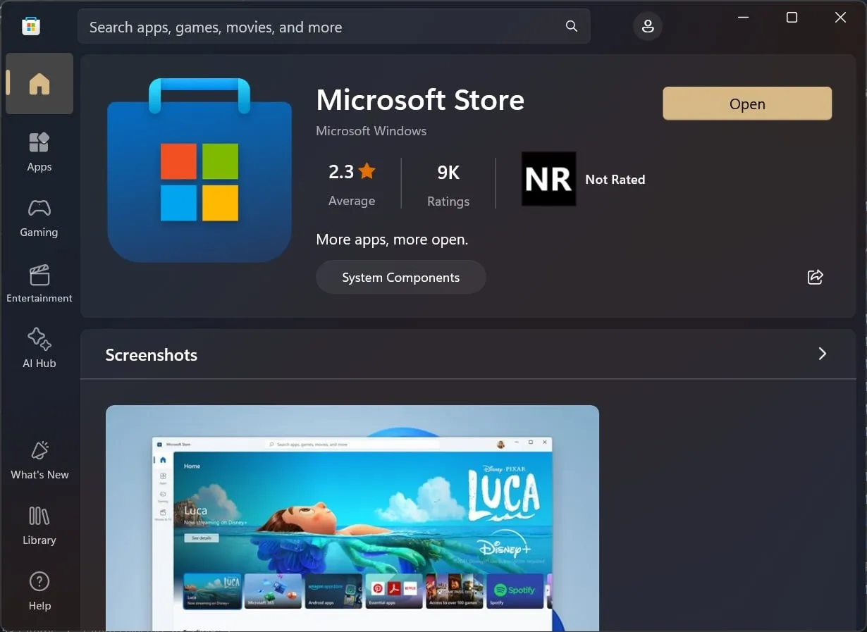
Visual comparison: the previous Windows 11 Store UI set for replacement:

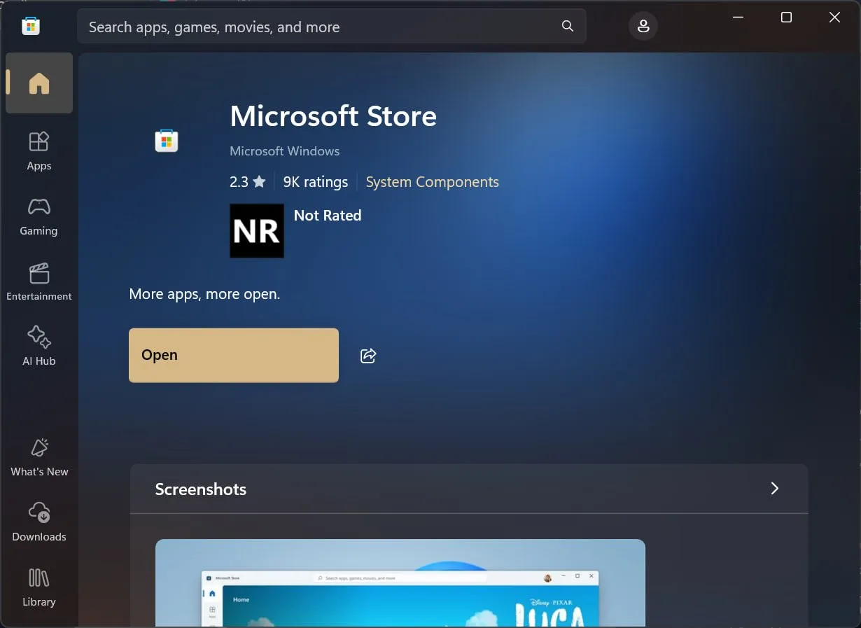
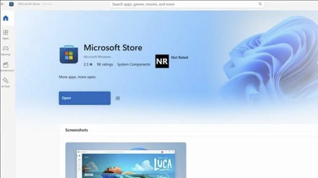
The new Windows 11 Store UI, currently being deployed:

Notable changes include the repositioning of buttons and an increase in empty space throughout the Store. The alignment of the “Open” text is noticeably off, and reviews have become less visible following the update.
“It seems like the Microsoft Store team might need to consult an optometrist, or maybe even a therapist. Calling the layout on the right an improvement over the left is absolutely ludicrous. We’ve returned to the days of Windows 10 when pages appeared incomplete at launch,” stated Albacore in an X post, juxtaposing the two designs.
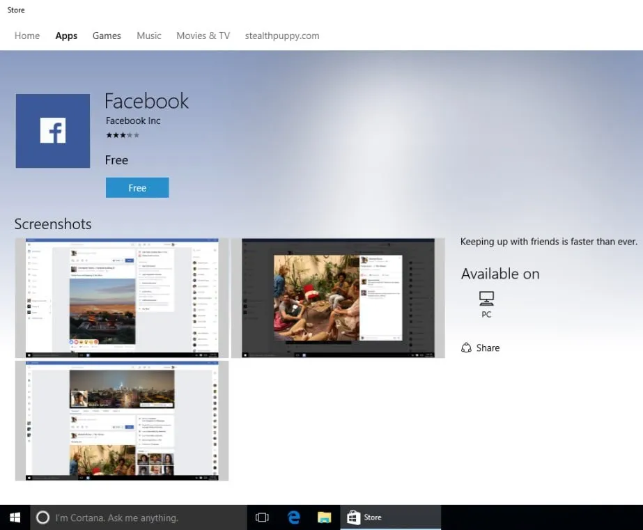
For additional context, here’s what the Windows 10 Store interface looked like in 2016:

Is the newly designed Windows 11 Store reminiscent of its 2016 counterpart? Indeed, but it leans toward a more modern appeal, demonstrating the subjectivity of design perception.
There are certainly advantages in the new Microsoft Store for app and game developers. The visibility of crucial elements like ratings and the “Open” button has improved, offering a more organized presentation of information.
Rudy Huyn from Microsoft has defended the new Store design, asserting its superiority despite apparent similarities to the Windows 10 Store.
“We have conducted A/B testing on this design for several months this fall, and the overall results regarding retention and conversion have been quite positive for our publishers,” Huyn remarked in an X post noted by Windows Latest.

“I encourage everyone to explore games, movies, and apps in a standard window size and form their own opinions instead of relying solely on screenshots from unusual scenarios,” he added.
“Many of the design changes were made in response to earlier feedback.”
Microsoft continually implements adjustments, rolling out updates through numerous experiments.
Other design layouts are already undergoing testing, and Microsoft plans to keep refining the Windows 11 Store UI to enhance user engagement (downloads and installs).
The Windows Store Has Significantly Improved
While the Windows Store still has room for growth, it is clear that Microsoft is cognizant of existing issues and is actively working to enhance the experience.
As previously reported, the Store has recently undergone significant advancements. Download speeds have improved following recent updates, and Microsoft is incorporating Winget into the Store, which is set to transform the update process for Win32 applications like Discord.
This integration will provide users with the latest versions of applications instead of having to wait for apps like Discord to perform their own updates.
What are your thoughts on the recent UI alterations to the Store? We’d love to hear from you in the comments below.
Leave a Reply