How to Make an Excel Run Chart
There are several built-in charts in Microsoft Excel that users may use to present their data, such as bar graphs, columns, pie charts, and line charts, but in certain circumstances, users will develop customized charts, such as the Run chart, to display data to their audiences. A Run chart is a time-series graph that presents observed data. In this lesson, we’ll show you how to create a Run Chart in Excel.
Charts are useful when users want to provide their data to their consumers in a graphical format that is easy to interpret. Charts are useful for summarizing vast amounts of data, displaying data categories in a frequency distribution, and estimating critical values.
How to create a Run Chart in Excel
To create a Run Chart in Microsoft Excel, follow these steps:
- Start Microsoft Excel.
- Fill up the Excel spreadsheet with your data and highlight it.
- Insert a line by clicking the Line button, then selecting Line with markers from the menu.
- Cut the chart by right-clicking it.
- Input the Median formula, then choose the range of cells that contain the numbers you’re looking for.
- Slide the Fill handle down to see the other results, then click the Insert tab, then the Line button, and finally Line with markers from the menu.
Let’s take a closer look at this.
Start Microsoft Excel.
Fill up the Excel spreadsheet with your information.

Highlight all of the data that you wish to include in the chart on your spreadsheet.
Next, in the Charts group, click the Line button, and then pick Line with markers from the menu.
Right-click the chart and choose Cut.
A median line will be added to the chart.
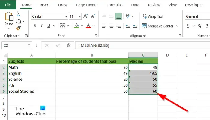
Insert the Median formula and the value range, for example =MEDIAN (B2:B6).
To see the other results, drag the Fill handle down.
Highlight all of the spreadsheet’s data (including the Median).
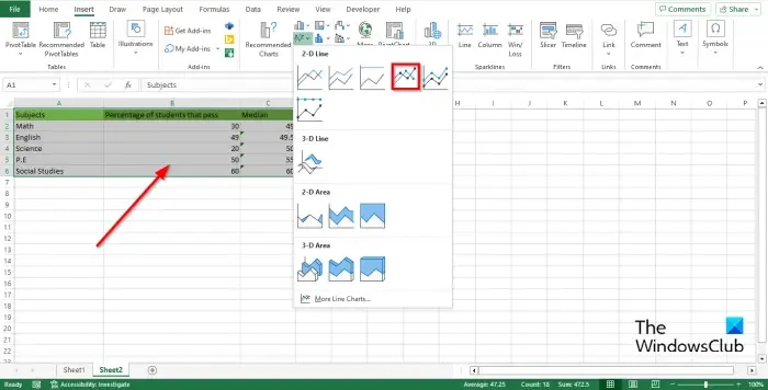
Next, on the Insert tab, pick Line with markers from the menu, then click the Line button in the Charts group.

The figure has been updated with a line that summarizes the median.
We now have a run chart.
We hope you now know how to make a Run chart in Excel.
Why is it called Run chart?
Run charts are used to track the performance of a process over time with an emphasis on process improvement; they illustrate the series’ measurement over time. Trend charts and series plots are other names for run charts.
What is the difference between a Run chart and a Control chart?
The Run chart and the Control chart are close, but not identical. A Run chart may be used to track data over time to identify shifts, trends, or cycles. Run charts will assist you in identifying upward and downward trends. Control charts help you comprehend the inherent variance in processes. The control chart has upper and lower control limit lines, as well as a midline.
Leave a Reply