Frustrations with Camera Control Features on the iPhone 16
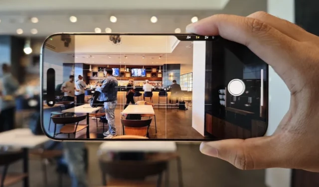
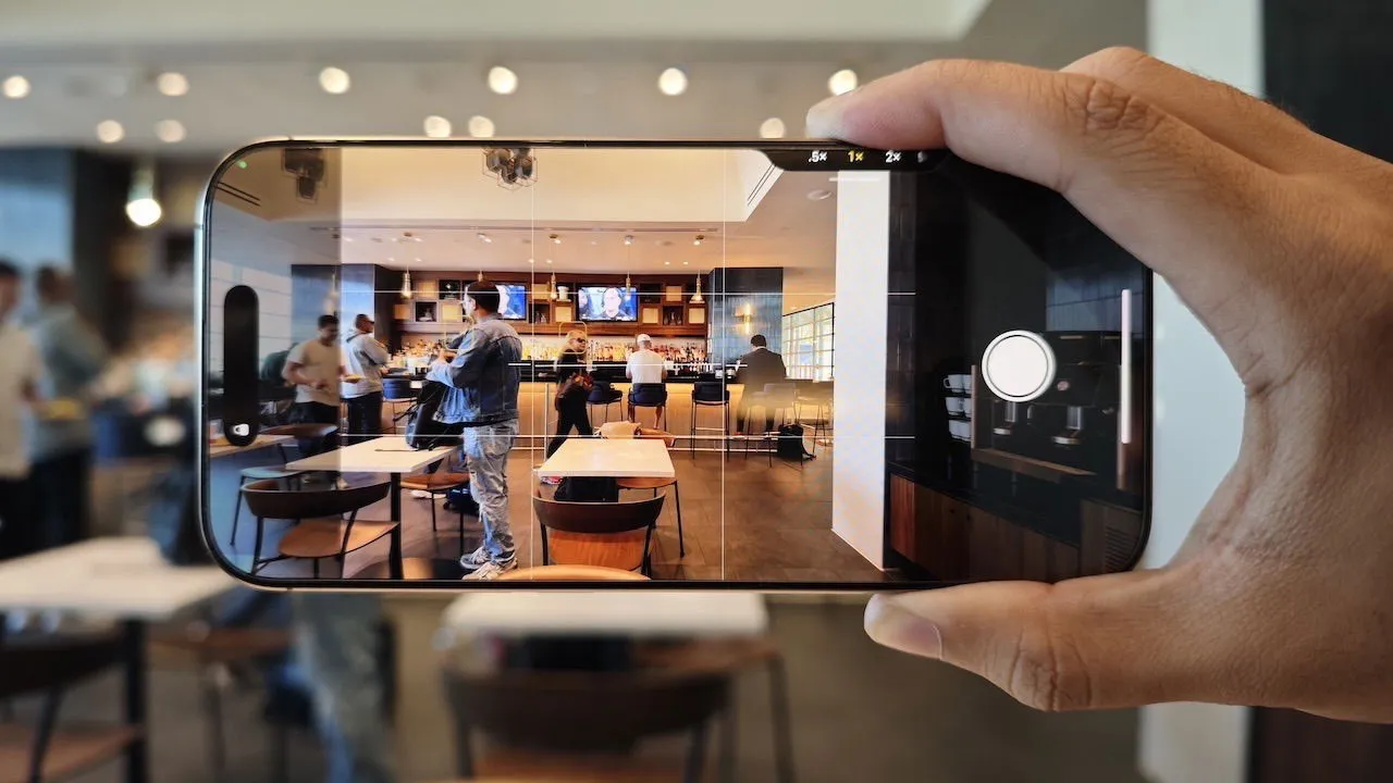
Initially, there were speculations about Apple eliminating physical buttons altogether. Instead, the last two years saw the addition of new controls to the iPhone lineup: the Action button on the iPhone 15 Pro and the Camera Control button on the iPhone 16. As someone passionate about photography, the idea of a two-step shutter-like button on my device intrigued me. However, after acquiring the iPhone 16 Pro Max, my experience with the Camera Control button has been filled with frustration.
First Encounter with Camera Control
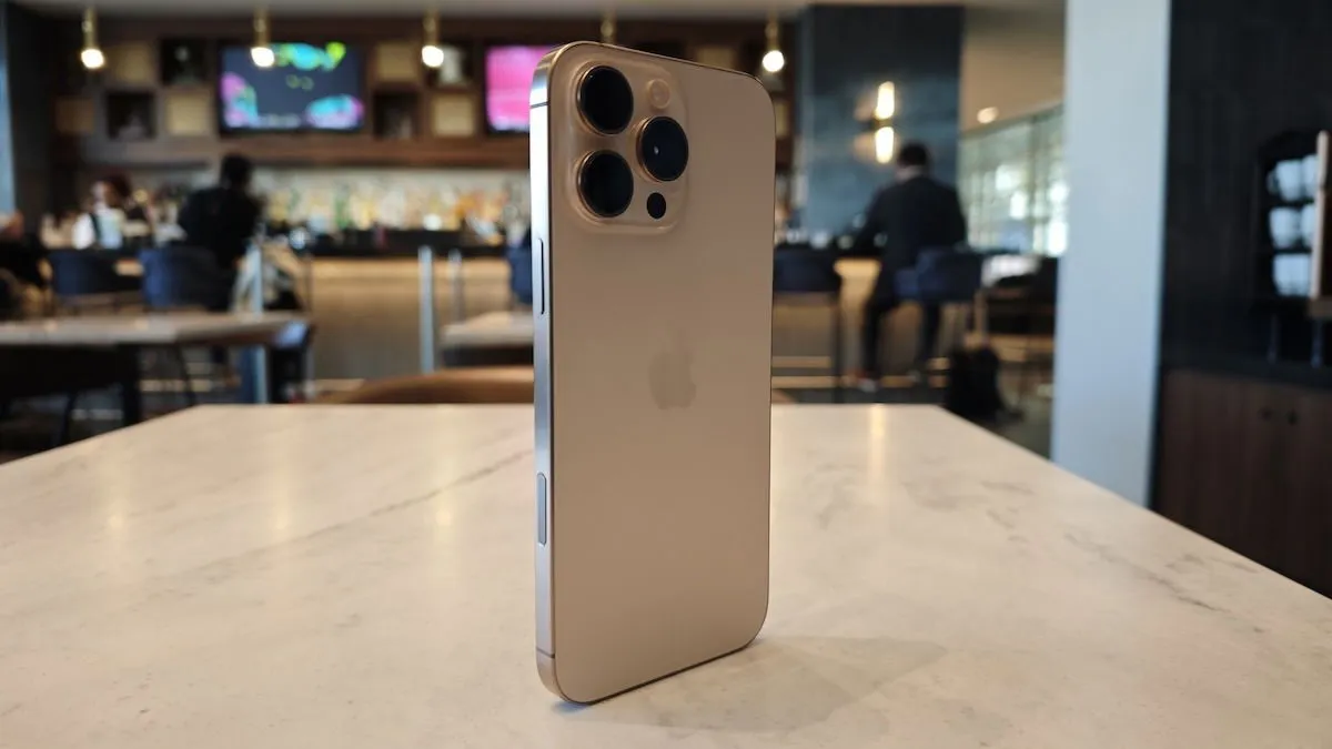
To activate Camera Control, you need to press the lower button on the right side of your iPhone, which opens the camera application. Additionally, there’s a touch-sensitive area on top of this button that can be utilized for various functions.
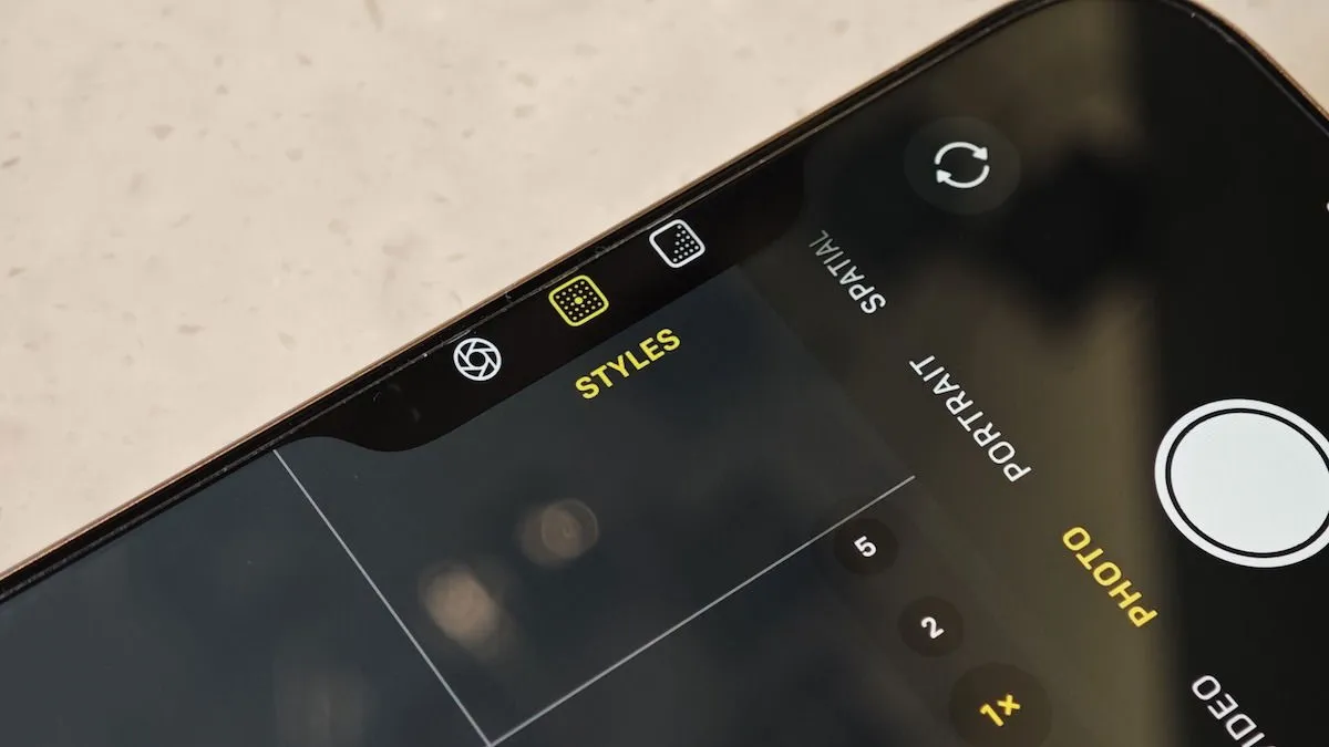
You can, for instance, slide your finger across the button to zoom in and out, or double-tap to switch between functionalities. These include Zoom, Styles, Portrait Mode settings like Aperture, and Exposure Value adjustments, with Apple promising more features, such as the ability to lock focus on a subject in upcoming updates.
Challenges with the Camera Control Button
On paper, the Camera Control feature appears to be a great enhancement for capturing photos with your iPhone. However, the reality falls short, primarily due to its awkward positioning.
1. Positioning Problems
Upon seeing the Camera Control button during Apple’s presentation, my first reaction was: “While it seems useful, is it positioned too high?”
This suspicion was confirmed the moment I unboxed my phone. I anticipated using Camera Control mainly when taking pictures in landscape mode, akin to using a traditional camera. However, when holding the iPhone horizontally, the button feels uncomfortably high for my index finger to easily access.
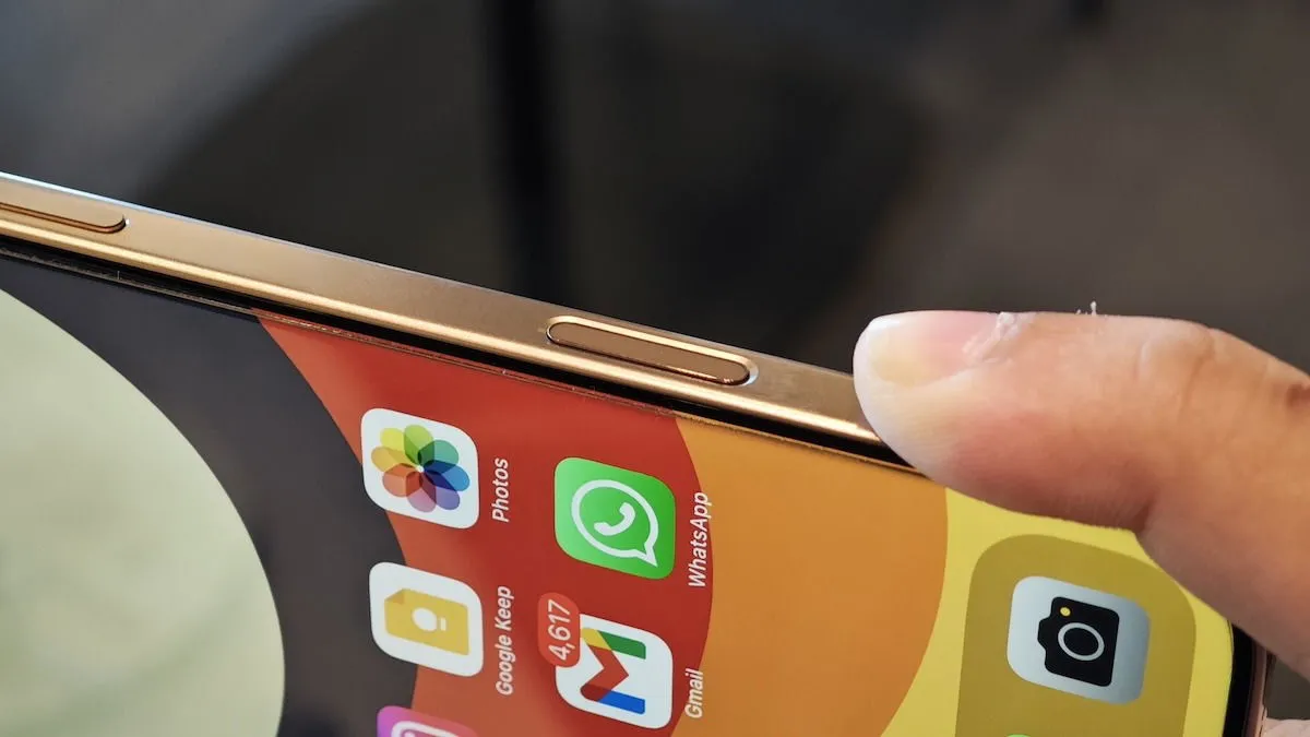
I found myself having to manipulate my grip uncomfortably to reach it. Even when I managed to press the button, this awkward positioning made it hard to stabilize the phone well enough, resulting in blurry photos.

I tried adjusting my grip for portraits, but unsurprisingly, I still found the button difficult to access. Although it became easier to reach, pressing it required significant force, resulting in shakes that blurred many of my images.
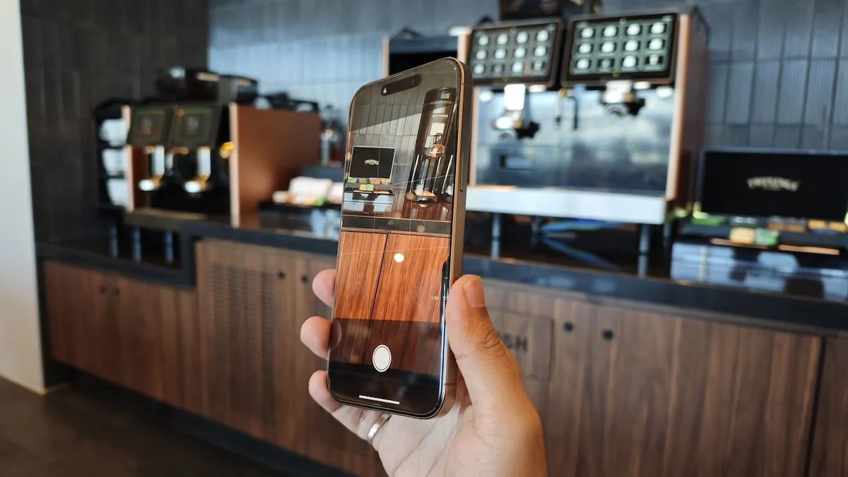
Consequently, I had to stabilize the phone with both hands. While the smaller iPhone 16 and 16 Pro might not show this issue, the larger 16 Pro Max necessitated a two-handed grip to effectively utilize the Camera Control button.
2. Unwanted Touches
In addition to its tricky placement, the design of the Camera Control button can lead to accidental taps. Since the surface is touch-sensitive, it responds even when I am merely holding the phone in a natural manner while capturing images. This occasionally activates the Camera Control interface unintentionally.
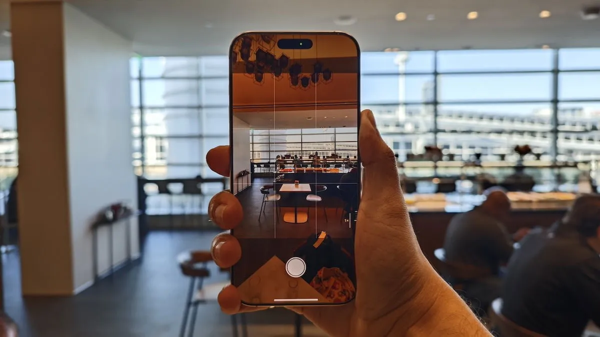
This issue tends to arise primarily when using the device without a case or with cases that have a pass-through design, like Apple’s silicone case. In contrast, I found that cases with a simple cutout did not present this problem. The challenge with these accidental taps is that when the Camera Control UI appears, it obscures the on-screen controls.
If I want to switch to the 5X lens using the on-screen toggle, I find myself waiting for the Camera Control slider to vanish before I can make the change, causing me to miss various shots.
3. Compatibility with Cases
Choosing cases with cutouts may seem like a good idea, but it presents a different set of challenges.
While this design can prevent accidental taps, it creates a new problem regarding reachability. You find yourself needing to insert your finger deeper to press the button, which can lead to further shaking and discomfort.
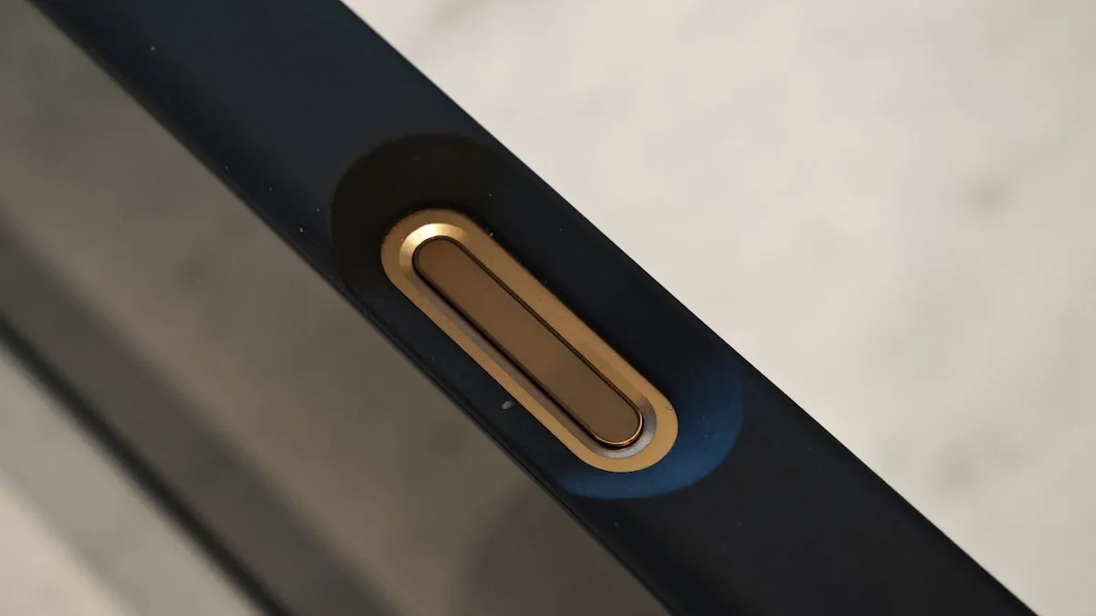
One potential solution would be to opt for a case that covers the button and to reduce the touch sensitivity settings, making it less responsive. However, this would necessitate pressing harder to engage the button, further increasing the likelihood of shaky photos.
4. Software Glitches
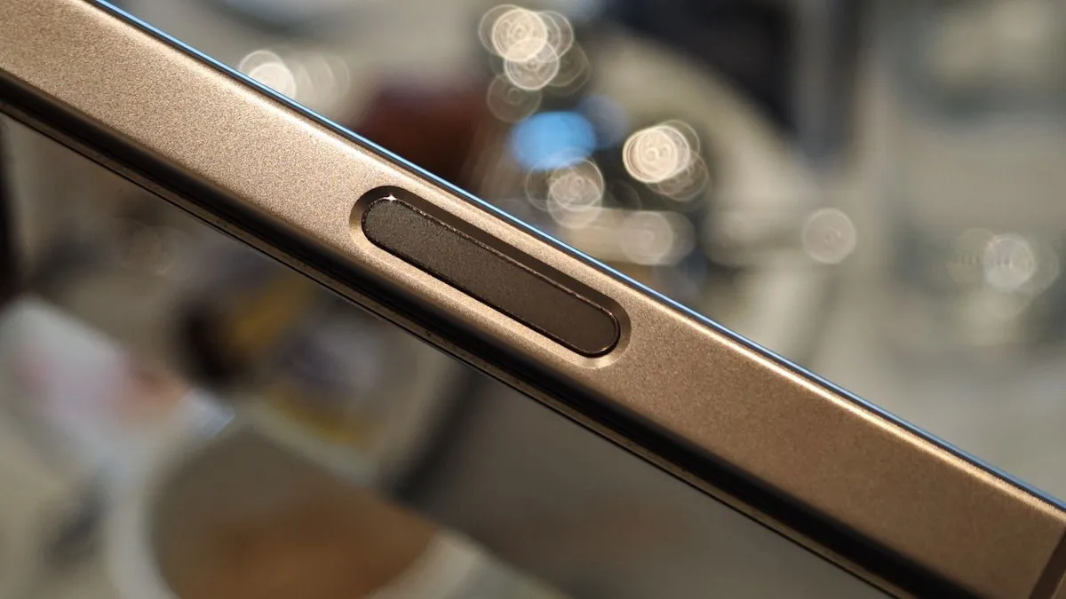
Once you navigate through these issues and are ready to use Camera Control, if you are operating in landscape mode with the screen off, an additional step is required. You must first press the button once to wake the screen, then again to access the camera app. A final press captures the image.
In portrait mode, the screen activates automatically, requiring just one press to take a photo.
5. Limited Functionality
Lastly, it’s frustrating that Camera Control’s functionality is still underdeveloped. During the introductory keynote for the iPhone 16, Apple showcased a Google Lens-style feature powered by their AI, but that capability isn’t available yet, with expectations for release later this year.
Currently, you cannot program the button to operate a third-party camera app like BlackMagic Camera; it is limited to either the default camera, Instagram, Magnifier, or QR code scanner. Apple does offer an option to disable the button, which may prove to be the most effective workaround.
An Unnecessary Feature
I recall loving the shutter button on my Sony Xperia Mini Pro, as it gave a genuine camera feel. That nostalgia fueled my enthusiasm for the Camera Control feature. Given advancements in screen technology, touch sensitivity, and robust on-screen controls in smartphones, I anticipated more from this innovation.
This leads me to conclude that Camera Control, despite its intent to enhance user experience, often feels superfluous. Actions like changing lenses, zooming, and focusing are generally much simpler to execute on the screen compared to using Camera Control. In fact, I’ve discovered that achieving precise zoom levels is easier via the touchscreen, as you can fine-tune more accurately without relying on imprecise swipes.
Such instances illustrate that Apple has introduced this feature without fully considering its practicality. Users may find themselves frustrated unless they navigate to Settings -> Camera -> Camera Control and opt to set its functionality to None.
All images and screenshots credited to Sumukh Rao.
Leave a Reply