Microsoft Bing Compact View toggle has been spotted by some users

If you use Microsoft Bing as your default internet search engine, you might encounter a new feature that the company has yet to officially announce. “yokoffing”, a member of the Bing reddit group (via MSPoweruser) has taken screenshots of a new toggle that has appeared in some Bing search results called “Compact View”.
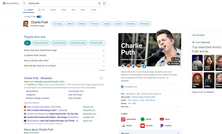
The new toggle has been placed on the top left corner of some Bing search results. When enabled, Compact View cuts down on the amount of information on a search result page. However, that also has the advantage of making that result page look less cluttered and busy so that perhaps people can find the information on their search inquiries faster.
It should be noted that “yokoffing”says that the Compact View toggle does not appear in every search result. It only appears if there is a Wikipedia entry for the search prompt. It looks like Microsoft may be testing this feature with a few people in the wild before it rolls Compact View out to more users.
MSPoweruser points out that this feature was tested before in Bing in 2021, but this new version makes a large number of changes in the search result layout. Hopefully, Microsoft will reveal more about this feature in the near future.
Source: Bing on reddit via MSPoweruser




Leave a Reply