Google Chat Introduces Split Pane User Interface for Web Version

Essential Information
- Google Chat has launched a new split-pane interface on the web to improve multitasking.
- Users can now engage with conversations directly from the home view without interruptions.
- This update includes a button for expanding to full screen and an option to toggle between split and single-pane modes.
Google has announced an update to its Chat platform featuring a split-pane user interface. This update signifies a departure from the previous full-width layout.
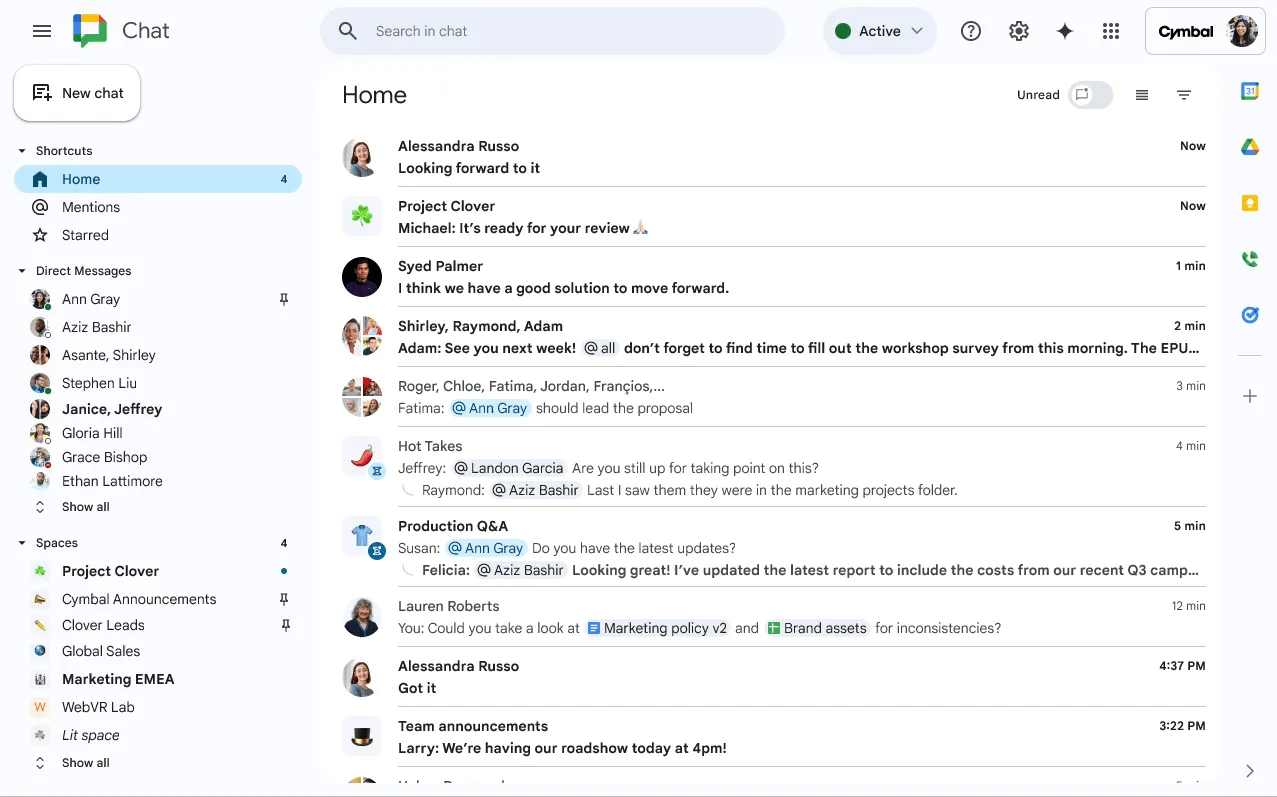
As detailed by Google, the new layout divides the screen into two primary segments. One section showcases your conversation list, while the other reveals the ongoing chat. This arrangement allows you to keep your context intact while responding to messages without the necessity of shifting screens.
To enhance usability, Google has incorporated an expand button located in the upper-right corner. This feature allows users to easily enter full-screen mode for a more immersive chat experience as needed. Additionally, users can toggle the split pane feature through the home header for flexibility.

This upgrade positions Google Chat alongside contemporary messaging services, accommodating up to four columns when including the left navigation bar and other tools such as the Gemini or Workspace side panel. These panels offer swift access to Calendar, Keep, Tasks, and Contacts.
The rollout of this feature will take place gradually over the next several weeks, targeting all Google Workspace users and Workspace Individual Subscribers. This update is part of a broader enhancement that includes the Gemini conversation summarization tool, delivering concise bullet points of unread messages to help users stay up-to-date.
GIF via: GoogleSource & Images


Leave a Reply