Windows 11 Context Menu: A Familiar Clutter Issue Like Windows 10
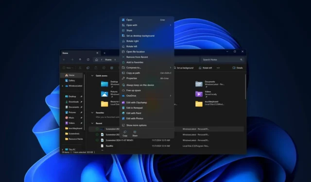
The latest update for Windows 11 has resulted in the modern context menu becoming more cluttered, resembling its predecessor from Windows 10. Notably, it now includes options such as ‘Edit with Paint’ outside of the ‘Open with’ submenu, raising questions about the initial purpose of the modern context menu if it was destined to become overloaded.
Alongside the Start menu and taskbar, one significant point of contention for users upon Windows 11’s release was the context menu. Microsoft introduced a new modern context menu in Windows 11, designed to occupy less space and adhere to Fluent Design principles, though it has apparently become more expansive rather than more compact.
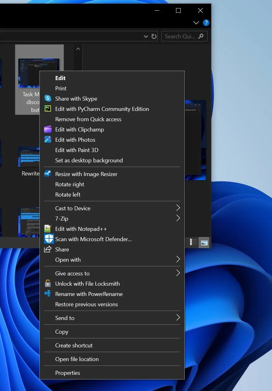
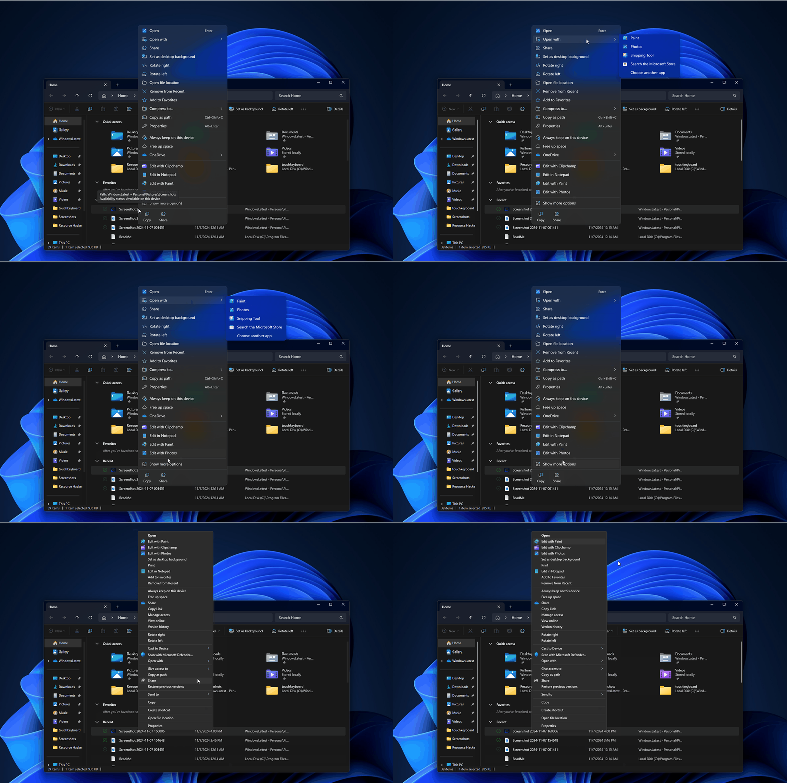
Following the release of Windows 11 Build 27744, it has been observed by Windows Latest and others that the context menu now features a new entry labeled “Edit with Paint” .
Given that the modern context menu is already quite expansive, these additions are immediately noticeable as they further increase its size.
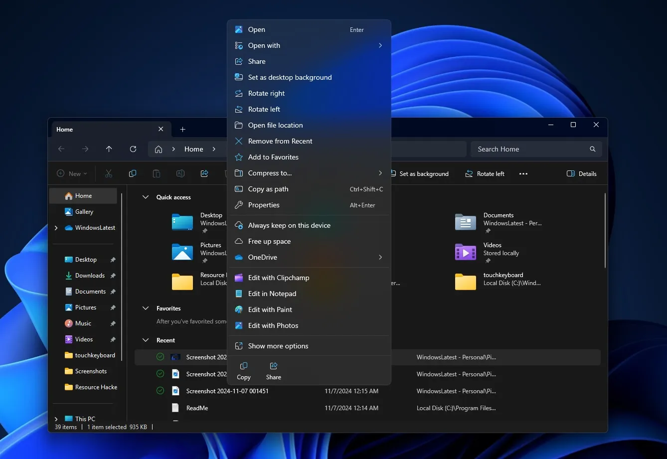
Additionally, if you select “Show more options” , you will see the same options listed there as well, as they originate from the same source:
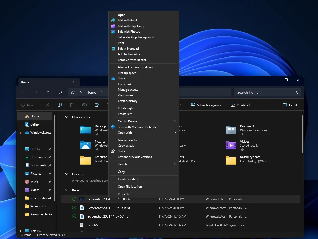
The screenshots above illustrate a significant issue with the modern context menu.
Instead of organizing functions like “Edit with Paint,” “Edit in Notepad,” and “Edit with Clipchamp” under the “Open with” section as they should be, these options now clutter the menu directly. It remains uncertain if this is a deliberate move from Microsoft, especially since third-party applications do not receive similar visibility.
This strategy of prominently displaying its own applications in the context menu only adds to the visual overload, as such functionalities could have been consolidated under the “Open with” submenu.
Ironically, one of the main reasons for revamping the context menu involved reducing visual clutter, which the modern design seemed to aim at.
In Windows 10, for instance, the context menu could often become overly extensive, sometimes dominating the entire screen. Microsoft claimed it would remedy these issues through the redesign, but it appears that has not been accomplished.
In reality, the opposite has occurred; the new context menu is not only more cluttered but also slower than its traditional counterpart. Users have voiced their frustrations on Feedback Hub, noting that the context menu now takes a longer time to appear.
There are instances when it even displays incorrectly, with options overflowing beyond their intended space, an issue noted after the rollout of Windows 11 24H2.
Performance concerns regarding these menus have also been reported by Windows Latest. Although the modern context menu has seen improvements in speed over the years, it still fails to match the efficiency of the Windows 10 context menu, especially on lower-end devices.
Aesthetically, Windows 11’s modern context menu is arguably more appealing, featuring a “modern” look with its Fluent transparent background, rounded edges, and softer designs.
However, the question remains: will Microsoft ever resolve the performance and clutter issues associated with it?


Leave a Reply