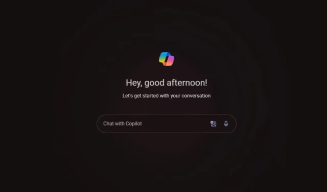
Users Express Discontent with Copilot’s New User Interface, But Temporary Solutions Exist

Recently, we revealed that Microsoft’s Copilot was set for a significant update featuring a revamped user interface. This redesign not only enhances aesthetics but also purportedly improves functionality, introducing users to four new Voice Modes.
However, as the updated interface begins to appear for users, many have expressed dissatisfaction. A dedicated Windows forum advocating for the restoration of the previous UI has generated hundreds of responses, indicating that Microsoft may have overlooked some critical feedback about this change.
Critics argue that despite its sleek appearance, the new interface has resulted in more generic responses from Copilot. Previously, users could rely on it for in-depth assistance with online research, but now it seems the AI’s capabilities in that area have diminished.
Some users label the new design as outdated and lacking professionalism. Regardless of the reasons, it’s clear that the latest iteration of Copilot isn’t appealing to everyone. Nevertheless, some have discovered clever methods to revert back to the older interface.
One workaround involved accessing Copilot via Microsoft Edge— a somewhat clever tactic—thus allowing continued use in the same manner as the previous app version. However, this method only remained effective for a short period; users attempting to use Copilot on Edge now encounter the new interface instead.
There is still one more alternative to explore, though it’s likely this too will be resolved by Microsoft quickly. If you’d like to try, simply click on this link while using Microsoft Edge:
edgeservices.bing.com/edgesvc/chat
For those who prefer a Dark Mode version of Copilot, use this link:
edgeservices.bing.com/edgesvc/chat?darkschemeovr=1
Since the new version of Copilot hasn’t been fully deployed, some users might still have access to the older interface. It’s noteworthy that those who have transitioned to the latest edition frequently report it to be lacking. Could this be Microsoft’s strategy to promote Copilot Pro? If that’s the case, the tech powerhouse based in Redmond could face some backlash.
What are your thoughts on this situation? Are you able to use the new version of Copilot, and how has your experience been? Please share if the provided links worked for you.
I personally appreciate the new aesthetic and its speed. However, I find its responses to be far more generic. I previously relied on Copilot for in-depth online research and as a resource for adding specific data to my writing. That functionality seems to be lost! I hope there’s a way to revert to the prior model.
Honestly, I can’t believe Microsoft thought this design would resonate with users. It’s utterly disappointing! How can I revert back to the previous white UI with my old chats visible on the side instead of this bland, minimalist layout?


Leave a Reply