Overview of Microsoft’s New Copilot: A Direct Competitor to ChatGPT
Microsoft’s Copilot is undergoing a significant transformation with the introduction of a voice mode, set to begin rolling out to select users in the upcoming weeks. The enhanced Copilot promises to be faster and more efficient, rivaling ChatGPT in several aspects.
Currently, Microsoft is piloting a “card-based” Copilot interface, which we’ve had the opportunity to enable in the new web-based design. This revamped version offers a sleek appearance and matches ChatGPT in terms of performance, with noticeably quicker responses that are now on par with those provided by ChatGPT. This update marks a major improvement.
Following the departure of Mikhail Parakhin, Copilot for consumers seemed to fall by the wayside, resulting in a “downgraded” user experience that lacks compelling reasons to choose it over ChatGPT—unless you are specifically interested in Bing’s verified answers.
In recent months, Microsoft has scaled back features including PDF file uploads and three operational modes in certain regions, restricted users to just 30 prompts, and has not fully capitalized on the capabilities of “ChatGPT-4.” Furthermore, details on the GPT-4o or the new GPT-o are lacking, leading to concerns that Copilot may still rely on GPT-3.5 or an internal model.
Additionally, the consumer version of Copilot Pro has removed the “Custom GPTs” feature, although it is still available with ChatGPT Plus.
Notably, Copilot for the web is not as smooth as ChatGPT or even Gemini, a frequent complaint among users. The mobile app for Copilot is also reported to be exceptionally slow, showing poor performance even for those subscribed to Copilot Pro. Overall, it fails to meet expectations and often does not function properly.
While Copilot currently falls short of its initial release standards, a significant overhaul is on the horizon.
This is the new Copilot featuring a card-based UI, enhanced performance, and a modern design

Upon launching Copilot v2, users will be prompted to enter their name for personalization. After that, you can log in to your Microsoft account. Remember, using Copilot without signing up for a Microsoft account is still an option.

Once logged in or after entering your name, you’ll notice a streamlined layout.

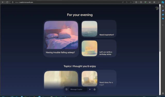
The new interface is designed with cards. One of the first elements you’ll notice is a revamped homepage that organizes content into rounded cards, each encouraging users to interact with the card and explore Copilot’s features.
For instance, you might encounter a card asking if you’re having trouble sleeping, with options to scroll down and discover more “cards” that act more as prompts than strict questions.
The color scheme has been refreshed, introducing two new themes called “Day” and “Night.” The Day mode features soft pastel colors, while the Night mode adopts a darker, more muted aesthetic.

At the bottom of the interface, a bar allows for immediate typing, and the design includes an “infinite” scroll feature for reviewing previous interactions or clicking the “history” button located at the bottom. It boasts a Fluid design with an Acrylic finish.

Here’s how it looks in dark mode:

This bottom bar remains accessible regardless of your position on the page, enabling quick access to ask Copilot questions.


A new voice mode is also introduced, drawing similarities to that found on ChatGPT Plus, though it currently appears to be experiencing issues.

As depicted in the screenshot above, Windows Latest identified four distinct voice models—Meadow, Wave, Grove, and Canyon—each representing a different tone or “vibe,” from calm and relaxed to energetic and focused.

On the right side of the interface, a convenient menu provides access to various settings and options, including your profile, language settings, theme selection (for switching between Day and Night modes), and a feedback section. The menu is compactly integrated, ensuring it doesn’t occupy much space while remaining easy to access when needed.
I will be updating this article with additional screenshots and videos in the near future, so check back soon. The significant redesign of Copilot is worth exploring.
Feel free to share your thoughts on the new Copilot in the comments below.


Leave a Reply