iPhone Users Criticize Apple for Cheap, Android-like Features in Latest Implementation
Recently, some iPhone users who upgraded to iOS 18 have encountered an unattractive iCloud design in the Apple Account section of the Settings app. This design has been dubbed “the most UnApple design in iOS 18,” and many users agree.
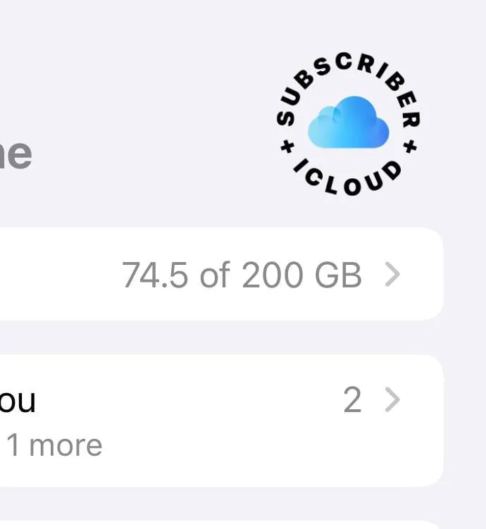
This design is arguably the most unattractive thing Apple has released, and Reddit users, myself included, have aligned our critiques with the same standards we apply to some dubious Android design choices, which is quite fair.
Analyzing the unfortunate design of the iCloud+ Subscriber logo, here’s what we observe:
- Unoriginal design pattern: The central placement of the iCloud icon with the text “iCloud+ Subscriber” surrounding it feels quite lazy. This ‘wraparound text’ design mimics styles seen in various platforms, from Shopify to Apple’s own News+ logo. One might wonder if the designer was under-resourced, or if Apple intended for it to stand out, albeit not like a sore thumb as it certainly does.
- Misspelled iCloud: Beyond the design choices, it raises questions as to why the “I” in iCloud is capitalized instead of the expected lowercase “i.” Furthermore, the wrap-around text reading “+Subscriber+ ICloud” remains a mystery to many.
- Color incongruity: While bold black text against a light blue iCloud icon might seem effective in theory, Apple’s implementation indicates that theoretical design can fall short in practical applications.
Regrettably, this is not an isolated incident. Users have reported numerous poorly executed designs throughout iOS 18. This instance further emphasizes a trend suggesting that Apple may not be as attentive to design quality as before, delivering buggy updates instead.
Comment by u/LateDisaster1309 from discussion the most UnApple design in iOS 18 in ios
It’s likely that the unsightly iCloud+ Subscriber design is merely a placeholder and that Apple will eventually introduce a more polished version. However, such issues are unexpected from a brand celebrated for its commitment to aesthetics, design coherence, and quality. Even Android users, like myself, can’t help but find this design cringe-worthy, and that speaks volumes!






Leave a Reply