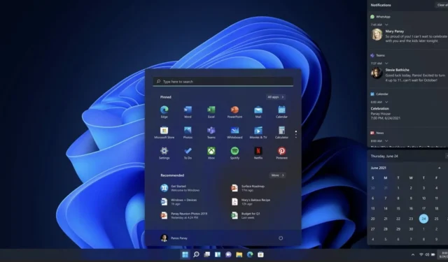
Microsoft plans to make Windows 11 taskbar less cluttered

Windows 11 dramatically change the taskbar experience. The design has been updated to support modern context menus and new APIs, and it has been rewritten from the ground up, which has several disadvantages. For example, some popular features users have enjoyed for years are noticeably absent.
Features like the ability to drag and drop files or apps on the taskbar for quick access were recently added to the operating system, but many features are still missing. While some Windows 11 features are still missing and the performance of the taskbar remains a concern, Microsoft is working on a couple of new features for the taskbar.
A new feature is being tested in the technical preview builds, allowing you to have a clutter-free taskbar. This is being made possible by letting users hide the date and time and other buttons like the system tray.
Windows 11’s new personalization feature could be particularly beneficial for devices with smaller screens or users who prefer a more minimalist appearance.
To activate this feature, right-click the system tray clock and select “Adjust date and time.”
As mentioned, Microsoft is also planning to bring back certain features while it continues to add new features to the taskbar. One planned update could get around the ability to ungroup app icons on the taskbar. This new feature could be called “never combine my icons on the taskbar”.
Windows 11’s taskbar has many limitations.
One of the biggest problems with the taskbar is that it has only been restricted to the bottom of the screen. Unlike Windows 10, 8, 7 or any older operating system version where the taskbar could be placed at the side or top of the screen, Windows 11 has restricted the taskbar to the bottom of the screen only.
In one of the webcasts for the Windows Insider Program, Microsoft’s developers stated the animation flow of the Start menu as the primary reason for this limitation. That’s because changing the taskbar position would also require significant improvements to the animations, the Start menu opens and the way apps are pinned.
As the taskbar has been entirely redesigned in Windows 11, Microsoft says it is focusing on adding more essential user features, such as drag and drop and the upcoming ‘hide date & time” option.
Unfortunately, if you are looking for the flexibility to move the taskbar, this is not considered a priority at Microsoft, at least for now.


Leave a Reply